Your brand has seven seconds to strike a good impression. With the sea of competition, standing out and appealing to your audience is a tall order. However, when done right, 13% of consumers would pay up to 50% more for your services or products if they perceive that your brand makes a positive impact on the world. Moreover, 55% of a first impression is made because of visual stimuli such as your logo or brand colors. Therefore, understanding the difference between visual identity vs brand identity is crucial for creating that lasting impression.
Furthermore, your brand must leverage the power of visuals to create a stunning first impression that catches and sustains your audience’s attention. So, how do you do it? Through visual identity.
What is Visual Identity?
It is hard to shake a bad impression—especially when you are up against millions of competitors online. When it comes to branding, your target audience will have no reason to give your brand the benefit of the doubt if your visuals are mediocre or unimpressive. After all, first impressions matter, and brands should work on conveying their personality to get customers’ attention and earn their trust.
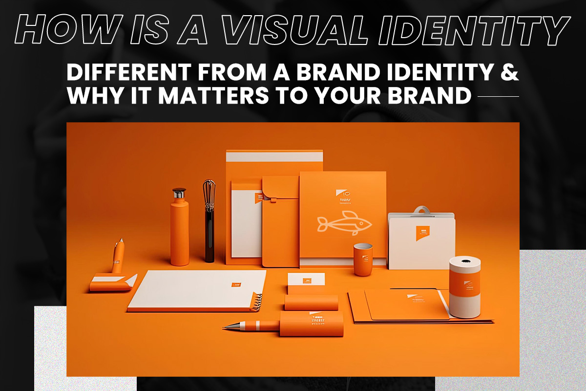
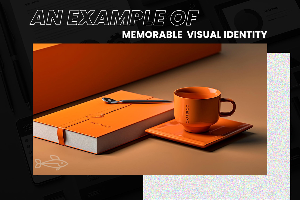
Visual identity is the visual elements that represent and differentiate your brand. It is how you shape perception and establish an impression through visual brand elements. When it comes to comprehension, our minds respond to visual cues in a ¼ second. As the brain is pre-wired to interpret visuals faster than it processes language, visual identity is crucial to the success of your brand. It reaffirms your core values and brand promise through visible mediums. In other words, visual identity is all of the imagery and graphical information that your target audience can physically see to identify your brand. By encapsulating your branding into a cohesive and complementary aesthetic, you develop brand recognition.
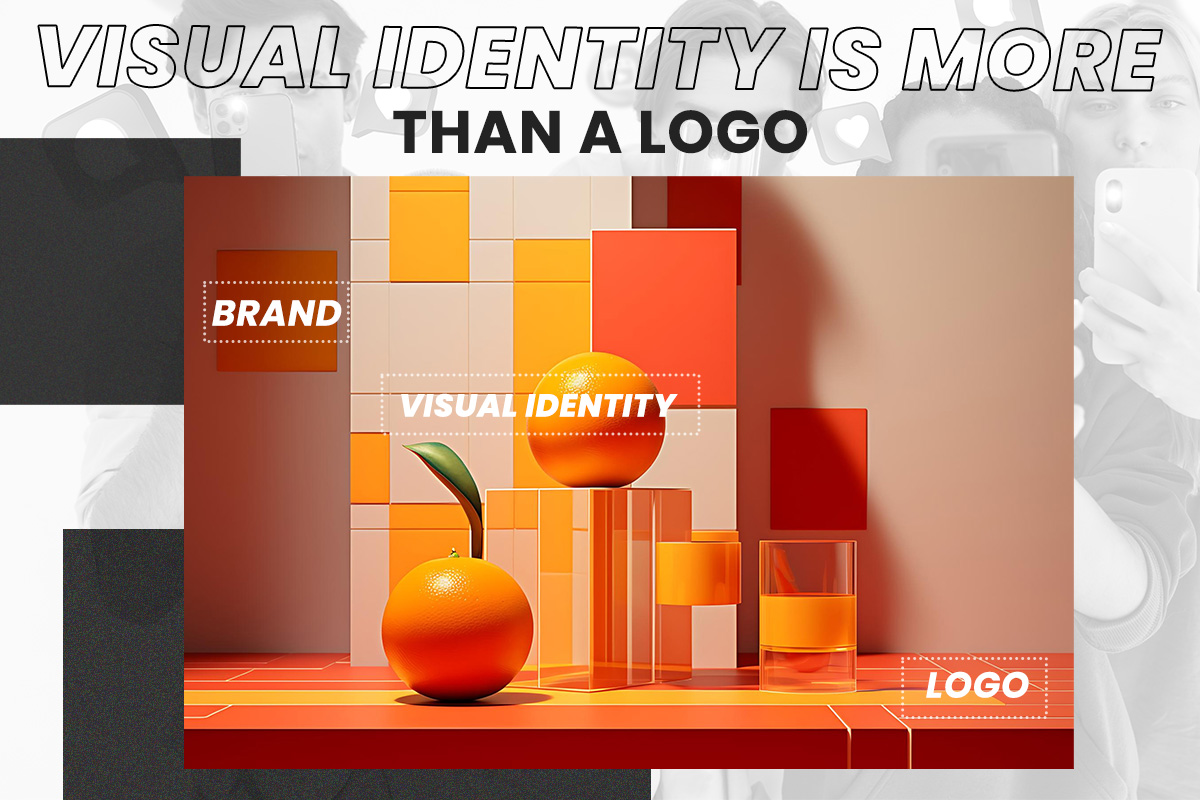
Understanding the difference between visual identity vs brand identity is essential. Visual identity comes after you develop your brand style guidelines so you can represent your brand cohesively and consistently at all times. You persuade your audience to relate to your brand through striking and emotion-evoking aesthetics.
The visual identity aims to:
- evoke an emotional connection and impression on a target audience – Nearly 50% of the brain is visual processing power. Modern consumers are visual learners. Optimizing your visual identity can make your audience feel like they understand the brand and can truly get behind your company’s identity. It’s all about connections!
- convey information about your brand or services/products offered – Humans process visuals 60,000 times faster than text. Consequently, it takes just 100 milliseconds for humans to recognize visual representation rather than text. When you have a consistent and cohesive visual identity, your audience can easily understand what your brand is all about or the products and services you offer (and most importantly, your company will stand out from social media noise.
- Consolidating the multifaceted aspects of a business through consistent aesthetics – Brand visual elements can establish a consistent personality that helps in brand visibility and recognition. When you establish a cohesive visual identity, you lay a solid foundation for your brand.
Visual Identity vs Brand Identity: Is there a difference?
Visual identity is one of the many aspects of brand identity. A brand identity summarizes your brand. It makes you recognizable to your target audience. In other words, brand identity is the collection of tangible brand elements that make the brand what it is. It covers visual identity along with non-visual elements including your brand voice, brand story, core values, mission statement, brand promise, copy editing guide, etc.
Understanding the distinction between visual identity vs brand identity is essential. Brand identity refers to the more internal aspects of your brand, whereas visual identity covers everything used to express those internal aspects. It is a distinct discipline that involves a different approach compared to brand identity. Although there’s an overlap, there are usually different people involved in the development of the two disciplines. Brand identity is overseen by marketers, whereas the development of visual identity is handled by a creative team.
In brief, visual identity and brand identity work together to shape a brand.

Why does visual identity matter?
A well-designed visual identity elevates your brand. It influences perception and leaves a lasting impression on your target market. Visual identity doesn’t just support your brand, it:
Sets You Apart
Among the millions of contenders online, you must set a striking, memorable, and impactful visual identity to stand out. Cohesive brand material that summarizes your business doesn’t just help you go head-to-head with your competition; you also stick out in your audience’s minds. It takes at least 5 impressions for people to remember a brand. Your brand should leverage it by delivering a consistent visual experience to your audience.
Makes Your Brand Relatable
Your visual identity represents your brand and creates a more customized experience. If you translate your brand story through your visual elements, you make your brand more relatable to your target audience. Meaningful brands which are viewed as making the world a better place outperform the stock market by 134%. As more consumers reward brands and companies that share their values, your brand should be able to convey your brand promise through your visual elements. These elements should emphasize your brand story and create a sense of understanding between you and your target audience.
Creates Consistency and Brand Continuity
95% of purchasing decisions are subconscious—meaning, your consumers’ purchases are driven by an emotional decision rather than a practical one. As visual identity evokes emotions, delivering consistent branding through visual branding is key. When you tie your visual identity to positive emotions, your audience will start associating those positive emotions with your brand.
This is why most marketers leverage emotional-based marketing campaigns. By giving your target audience a dependable experience regardless of the medium of communication, you establish a sense of reliability, comfort, trust, and ultimately brand recognition. A consistent visual identity supports a dependable customer experience that results in brand loyalty. The more your customers recognize your brand, the easier it is for them to prefer your brand over others.
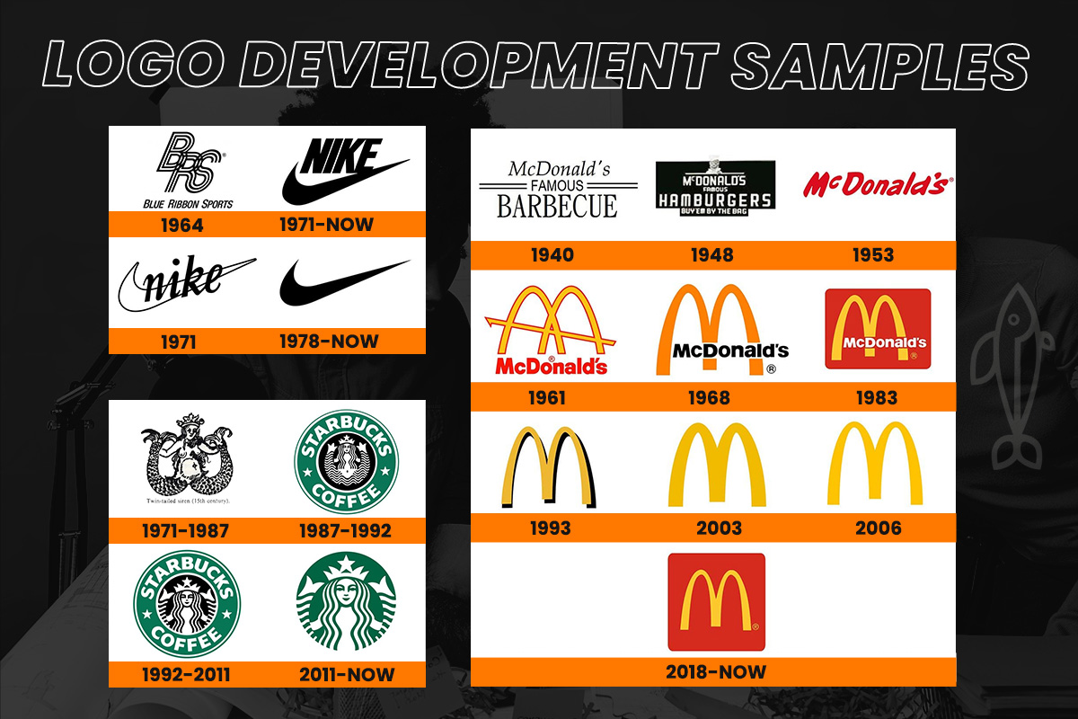
Brand growth is inevitable. Having a steady visual foundation that offers familiarity and cohesiveness amidst brand evolution reduces customer confusion. Even if your visual identity evolves, your deeply rooted visual elements will support your growth. Some of your loyal customers may be attached emotionally to your brand visuals. With a heavy emphasis on your visual identity foundation, you give your audience a sense of belongingness, familiarity, and continuity.
Fosters Brand Loyalty
Brand consistency leads to confidence such that your consumers expect they’ll have a certain experience when they engage with your brand. Customers are loyal to brands that they trust whereas a survey says 84% of customers are keener to stay loyal to a brand that they feel shares the same values as theirs. Having a well-defined and relatable visual identity makes it easier for customers to count on your brand. The more your customers are exposed to your visual elements, the stronger they connect themselves.
Builds a Better and More Genuine Customer Relationship
When you design a relatable and appealing visual identity, your target audience connects to you. Those that recognize your brand don’t have to be your customers. Brand awareness can go a long way and it increases your chances of improving conversions and sales.
Generates More Sales and Better Leads
You attract the right people and generate more sales if your visual elements such as your website, social media, and marketing collateral send a unified message about your brand identity and core values. Brand visual consistency improves leads to a 3.5 times greater brand visibility, which ultimately drives revenue by over 20%.
Brings Clarity
Why do you have to scribble thousands of words on what your brand represents when striking imagery and photographs can do the talking? A cohesive visual branding conveys your story and provides clarity on what your brand represents.
Preserves Brand Identity
Brands oftentimes face identity crises especially when they are stacked against their formidable competition. Through visual branding, you preserve your core branding. As brands improve the way they are perceived by their target audience, a strong, consistent, and cohesive visual identity can help preserve your brand identity. Adding visual elements to your brand story, etc. you present your brand identity more engagingly and entertainingly. Adding stunning visual elements to promotional materials can make your marketing more persuasive, more powerful, and more effective.
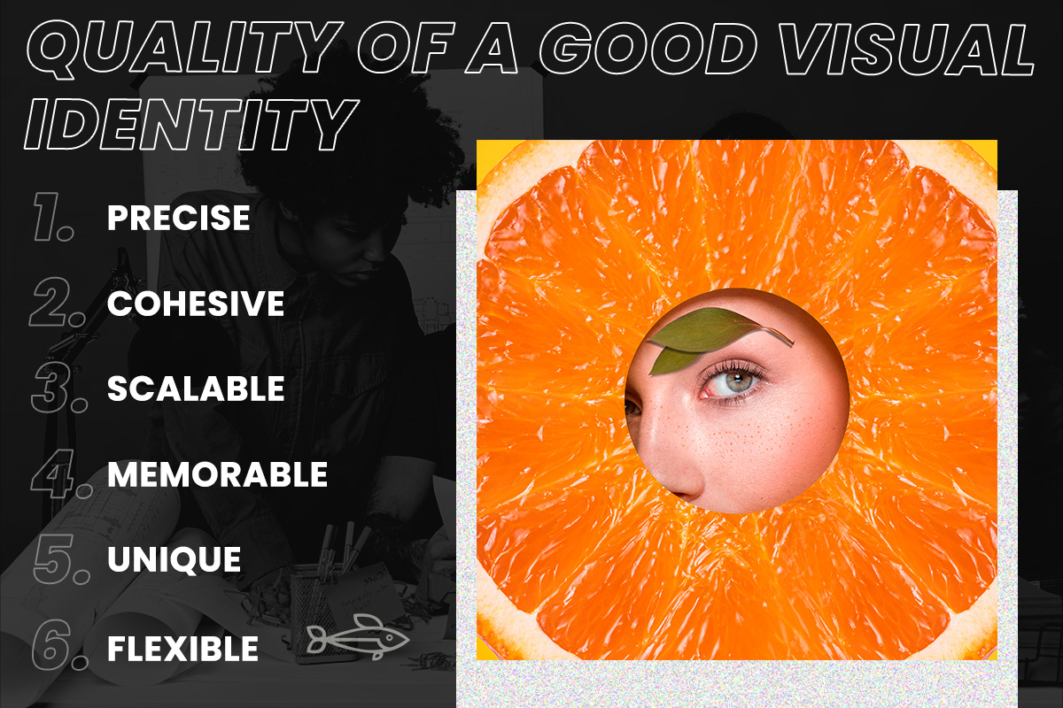
What makes a good visual identity?
You don’t just choose your visual elements haphazardly and call it a day. As you aim to create a consistent and lasting customer experience, you need to approach your design strategically to create an identity that truly summarizes your brand and can support it as you grow. From your marketing collateral to your social presence, a solid visual identity instantly communicates your brand, what you do, and why your target audience should engage with you. On the other hand, having a weak visual identity downgrades your customer experience.
Just because you have your logo, fonts, and brand colors doesn’t mean you have your visual elements nailed down to a T. You must have a cohesive, consistent, and accurate visual brand that conveys your brand story to establish a connection and foster customer loyalty. There is no size-fits-all template when it comes to visual identity as each brand is unique. It’s a matter of communicating your brand story through purposeful aesthetics. An effective visual identity is meant to be:
- Precise: Every detail of your visual elements should contribute to your brand story, personality, values, etc. Each element should represent your brand.
- Cohesive: It should be designed in such a way that each visual part works harmoniously.
- Scalable: Your visual identity should have a strong foundation in such a way that it can support and sustain your brand growth whether you are exploring new products or moving into new industries. Remember that you aren’t designing for the present, you are creating for the future. Anticipate brand growth before designing your visual elements.
- Memorable: Each element should create a lasting impression.
- Unique: A strong visual identity should set you apart from the competition.
Flexible: Each element works across different platforms and media.
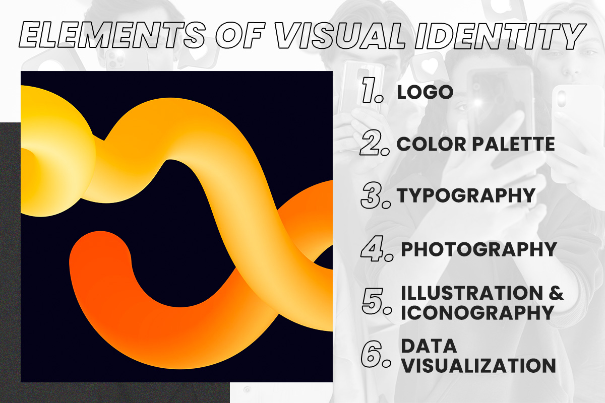
Elements of Visual Identity
No matter how excellent your brand story is, if it’s not supported by exquisite visuals, you’ll fail to attract your whole audience. Establishing a visual impression happens within seconds since your target audience is seeking constant validation. More so, the digital marketing industry is more invested in visual marketing than ever, making the competition a lot more cutthroat. Along with the development of your brand essence, brand story, core values, personality, etc., you should always support them with solid and relevant visuals. As it’s easier to consume and evoke emotion through images compared to written content, brands should focus heavily on their visual elements. Furthermore, retention is better with visual content compared to its written counterparts.
Think of your brand identity as a huge puzzle that requires many pieces that once assembled, sum up your brand. Visual identity isn’t just your logo or colors. Elements of visual identity include:
Logo: Your logo is the first impression of your brand. This element is the face of your brand that your current and target audience will come to recognize. It is the simplest yet the most important feature of your visual identity. Logo distinguishes your brand from the competition and any other organizations. It must be iconic and memorable that your customers will call your name as soon as they see it.
Color Palette: Color increases brand recognition by up to 80%. It influences 90% of an initial impression and 85% of a shopper’s buying decision. Brand color palette evokes an emotional connection with your target audience. It links your brand with a specific association a color represents. For example, blue creates an impression of reliability and serenity, which is why most banks go for the color blue to promote trust. As people tend to decide subconsciously based on visual elements, choosing the right color palette can persuade your target audience to do your desired actions. Specifically, it can influence your customers’ buying behavior.
Typography: This element gives your brand meaning. It defines the way people experience your brand and presents what your brand represents. Brand typography is the traits that support your brand design, voice, and personality. It arranges your company’s written content legibly. Although closely related, brand typography is different from brand font or typeface. Typography takes a large part of your brand identity from your logo, website, and emails, to your marketing materials. It affects the way your audience perceives and remembers your brand because it takes up a large portion of your visual identity. Memorable typography is immediately identifiable in such brands as Coca-Cola, Amazon, Cadbury, Canon, etc. Great brand typography should be legible, distinct, memorable, work across different platforms and media, and be able to convey brand personality.
Photography: Your brand photography includes photos of your products, team, process, your team, office, and other images that help you distinguish your brand. It’s not just about professionally-taken images, brand photography is all about cohesive images that tie up to your visual identity in terms of colors, tone, props, etc. Brand photography increases brand consistency which leads to improved brand visibility. Moreover, as pictures convey more information than text-based content, images can increase retention and boost engagement. 65% of marketing execs claim that photos, videos, etc. are important to communicating your brand story.
Illustration and iconography: Illustrations express subtler or more complex situations. They introduce narrative elements to visual content as they veer away from realism. Having illustrations as part of your visual elements unifies your brand identity and makes your brand more recognizable. They enhance the range and depth of messages that you intend to convey visually. Meanwhile, iconography highlights the key messages and content of your brand. It helps your target market absorb and process information more effectively as it gives your content greater substance without being verbose.
Data visualization: Designing data based on your brand style increases retention and makes your content more impactful. Data visualization is the graphical representation of data and information that provides an accessible way to understand patterns and trends in data. Presenting data in a familiar and accessible format preserves your brand identity while delivering your audience quick information.
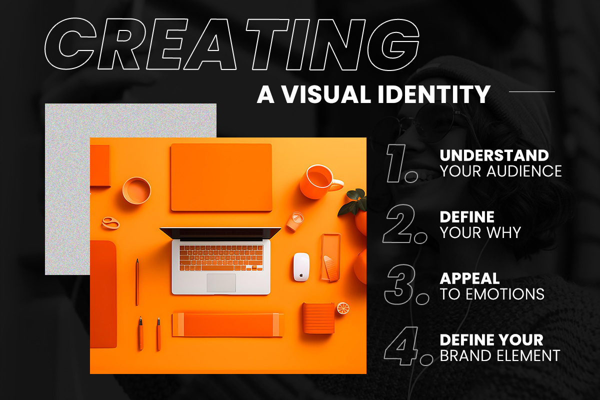
How to create the visual identity
From logo, typography, colors, and photography to icons, you need to structure your visual elements according to your tone of voice, brand message, services, core values, and target market. By using consistent visual identification, you ensure a surefire way to become memorable and recognizable. Ultimately, the goal is to make your target audience remember your brand and their previous interaction by simply seeing your brand colors, icons, or even fonts.
Visual identities aren’t exactly exclusive to billion-dollar companies. Even small businesses need to create a cohesive visual language to increase brand awareness and recognition and connect to their existing and potential audiences.
Whether you are building your visual identity from the ground up or overhauling your existing visual elements, here are the key factors that will help with the development or evolution of your visual language:
Understand your audience
A visual identity has the power to spark the interest and curiosity of your audience. But how can you intrigue a group of people if you don’t know them? Look at your demographics and psychographics to know your audience on a deeper level. Create a buyer persona and define their age, gender, income, job descriptions, purchase behavior, interests, and lifestyle. Include their pain points, desires, and personality. You need to understand your audience to appeal to their desires and wants. Defining your audience makes the development of visual elements easier and allows you to identify how to talk to your audience with the language, tone, and terms that best relate to them.
Define your Why
Revisiting your company mission or establishing long-term objectives can provide important insights into the qualities you’d want your visual identity to represent. Your core understanding of your mission will serve as your foundation for your visual identity. Allow your visual identity to grow and expand as you move forward through the development process.
Appeal to Emotions
Focusing too much on your product’s or service’s utility can make your brand look bland. However, 71% of customers who have an emotional connection with a brand will likely refer to the brand. Moreover, customers who are emotionally connected to a brand have a 306% higher lifetime value. Indeed, your visual elements have the power to convey your brand story and elicit emotions from your target audience. Therefore, knowing what emotions you wish to evoke from your customers will set the standard for your visuals and imagery.
Define Your Brand Element
Part of establishing your brand is conveying your core values and personality through vivid visual elements. Your visual elements are media that relay your story to your customers. At the core of your visual identity are these elements
- Logo
Your logo is your target audience’s first contact with your brand. Make sure your logo stands out and represents your business. Before sketching your logo, consider getting style inspiration. Think about your brand personality, identity, target audience, and competitor. Keep your logo simple yet memorable. Make it timeless yet scalable to accommodate the different mediums. A simple logo means using one or two corporate colors, fonts, and other elements. Your target viewers should easily get your story at first glance of your logo.
- Color Palette
Color enhances your brand experience from your website to your social media posts. When choosing brand colors, under color psychology first. It will give you an insight into the type of emotion that you want to appeal to your audience. Do you want your customers to be happy or entertained? Do you want them to feel confident or empowered? Think of your brand personality. Are you fun and funky? Inspirational? Or Corporate? Identify what your brand represents so you can align it with relevant colors. Your brand colors will appear on your logo, website, emails, social media channels, in-store, events, etc.
- Typography
Every font delivers a different message. At this point, you already know your brand personality so choosing the right typeface for your brand should be easier. Typography should support the shape and style of your logo for a cohesive and coherent look. Your brand font should be legible, and memorable, work on different channels, and convey your brand personality. Studying the anatomy of letterforms can help you choose your brand typography. Determine a primary, secondary, and tertiary typeface that you can use for your headers, sub-headers, and body text. Test these fonts for legibility in print and on-screen.
- Photography
As so much of your brand story is conveyed through imagery, photography is an essential part of your visual identity. Create a list of key photos you want to have before a photoshoot. Types of photos you might want could be the flat lay of your products, headshots of your team, pictures of your building, etc. If you are using people-heavy images, think of your viewer and how these images represent your brand. Use consistent, cohesive visual styles and ensure high resolution. When it comes to stock photography, it’s possible to create a unique design using stock images. Nevertheless, you need to make sure you establish the dos and don’ts when it comes to things like filters, resolution, etc.
- Illustration and iconography
Illustration and iconography can cut through the distraction and convey complex emotions quickly. When coming up with illustrations and iconography, go for versatile style or design. The illustration and iconography system should evoke memorable emotions as it seamlessly complements texts, photography, and other graphical elements without distorting or confusing the message. Come up with a list of rules/criteria that will unify your system for reference. Go for custom iconography instead of clip art. Ensure that the image you use is relevant to the subject and the symbolism is relevant.
Coming up with a unique illustration style allows you to visually brand your content but you don’t want to go over the top. The goal is to ensure that your illustrations are replicable especially when there are multiple designers involved.
- Data visualization
Not all brands need data visualization guidelines, but it’s wise to have them as design can improve comprehension and retention. Bad design affects data and negatively impacts trust. Determine the most common data visualizations you see across your organization and create a style guide. This guide can be a straightforward list of charts and graphs that should be consistent and uniform in design. After developing a style guide, you can refine the more specific attributes for a cohesive identity. Your style guide will continually expand as new elements and considerations are introduced.
What is visual identity in Social Media Content?
Visual identity in social media content focuses on making your imagery, videos, infographics, and other visual content cohesive to your overall brand identity. Incorporating your brand’s visual identity into your social media content creates unity, consistency, and recognition in your social. It makes your brand credible, relatable, and relevant. The more you use a cohesive visual identity for your target audience, the more trustworthy you become.
How can visual identity help in social media marketing?
When you have your visual identity tied up to your social media marketing, your brand becomes credible, coherent, and cohesive. Maintaining your visual identity across the different platforms is important, however, don’t just cross-post the same visual content in all your accounts. Bear in mind that your audience from different platforms has varied tastes and preferences. Customize your content based on the platform used and target audience. Ensure that your visual content is suitable to your target audience’s experience. Should you post something scrollable yet lengthy? Are your videos meant to entertain? Asking these questions will help you determine the type of visual content you need to create and upload on every platform.

Establishing a social media visual style guide
Having a social media visual style guide keeps your brand in check and consistent across different platforms. It shapes what people think when they hear your name and how they describe you to other people. Unlike your social media strategy, your social media visual guide summarizes how your strategy should be represented and conveyed in terms of brand identity. No matter how small or big your social media team is, the tone and appearance of each post should align with your brand.
Creating a coherent style guide not only produces quality and consistent content but also supports your brand such that your audience immediately recognizes you. There is no one template for creating a social media visual style guide but you can start with these:
Consistent Color Palette
Take note of the colors used by any popular brand. These brands strictly follow a certain color format where the colors are derived from their logo. Similarly, embrace the same strategy and pick two or three colors from your brand colors. In this way, you can generate a high recall value for your brand as you help your viewers get familiar with your brand. To get playful with your posts without straying away from your brand, use color shades. Color shades match the continuity of your posts.
Coherent typography and fonts
Your typography and fonts should reflect the values and personality your brand wants to represent. Use the font that you’ve established in your branding and find other fonts that complement your main fonts. Don’t go with more than four supplemental fonts to avoid confusing your audience.
How to keep your visual branding consistent
It’s becoming increasingly challenging to maintain consistency when you handle multi-channel marketing for your brand. To unify all these communication channels, you need to focus on brand style, substance, and story.
Let your visual identity provide comfort and familiarity to your audience whether you opt for festive colors or a laid-back simple palette. After all, it’s not just the message that speaks to your audience, it’s also how you say it to them. Therefore, the tone and attitude of your content are crucial in delivering context. For instance, if your visual elements are lighthearted and funky yet your copy is heavy and straightforward, it can confuse your audience and disrupt your message. Ultimately, great campaigns are established on a consistent concept yet offer enough variation to keep viewers anticipating how they’ll experience the campaign message next.
A visual identity is just a facet of your brand. Carefully crafted visual elements convey your message and story and set the tone for your entire branding. Having a consistent, on-brand visual identity increases your chances of producing higher ROI for your marketing efforts. It also establishes a deeper connection to your potential customers and creates a memorable brand experience that inspires repeat business.
If you place a few pieces of your marketing materials or check your visual content, would you see a clear, cohesive theme that conveys your story accurately? Or would you see a jumble of blurry pictures, varied color palettes, and tones that distort your message? If the answer is yes, it’s time to revisit your visual identity or develop one that ties into your entire branding identity.

